In this e-book, I explain the origins of U.S. executive pay practices, highlight the shortcomings of the measures commonly used to guide pay design, propose better measures of pay dimensions, and show how these better measures can improve benchmarking, pay design, and Say-on-Pay voting
U.S. executive pay has shifted from value sharing to target dollar pay
The objectives of executive pay have been the same since the rise of large companies in the late nineteenth century. Shareholders want to provide strong incentives for managers to increase shareholder value while retaining key talent and limiting shareholder cost. What’s changed is how companies try to achieve these objectives. In the first half of the twentieth century, executive pay was based on value sharing in economic profit. Since then, executive pay has shifted from sharing formulas to target pay values based on labor market analysis.
In 1922, General Motors adopted an executive pay plan that made the total bonus pool equal to 10% of economic profit, that is, profit in excess of a 7% return on capital. This formula covered stock and cash incentive compensation for everyone at GM who got a bonus. GM used this formula for 25 years without any change in the sharing percentage or the required return. It used the same basic concept, with slight changes in the sharing percentage and required return, for 66 years (1918 through 1983). In 1936, a study by John Baker of Harvard Business School found that 18 of 22 companies studied had similar plans.
The GM type plan does a good job of providing strong incentives and controlling shareholder cost but can make retaining key talent challenging. The plan provides strong incentives because the sharing percentage is held constant. If employees double economic profit, they get double the bonus. It limits shareholder cost because the sharing percentage doesn’t rise above 10%. It can have a more difficult time retaining key talent because the bonus formula can be zero due to market and industry factors beyond management’s control. GM improved its ability to limit retention risk by creating a bonus reserve. The bonus reserve was created by paying out less than the formula amount in good years to provide additional funds for bonuses in years with poor performance due to market and industry factors.
Since the 1950s, U.S. executive pay has shifted from target sharing to target dollar pay. Target dollar pay is expressed in terms of industry or peer group pay, e.g., target pay is the 50th percentile of peer group pay. The conventional wisdom is the 50th percentile target pay with a high percentage of pay at risk will achieve the three basic objectives of executive pay. The company will retain key talent because it doesn’t allow target pay to fall below the 50th percentile. It will limit shareholder cost because it doesn’t allow target pay to rise above the 50th percentile and it will provide strong incentives as long as the percent of pay at risk is high.
There is a flaw in the conventional wisdom of providing target dollar pay: It creates a “performance penalty” that undermines management incentives
There is a flaw in the conventional wisdom. A high percentage of pay at risk doesn’t ensure a strong incentive. Target dollar pay creates a fundamental “performance penalty” that reduces management’s incentive and undermines the alignment of cumulative pay and cumulative performance. We can see this if we compare the consequences of target dollar pay for two scenarios with the same cumulative performance. In “Good Early Performance” in Figure 1 the stock starts at $10, then rises to $33.04 at the end of year 3 before dropping to $20.91 at the end of year 5. In “Bad Early Performance” the stock starts at $10, then falls to $5.55 at the end of year 2 before recovering to $20.91 at the end of year 5.
In each scenario, we provide a stock grant equal to market pay ($1,000) based on the stock price at the start of the year. In year one, our CEO gets the same number of shares (100) in each scenario. But, in year two, our CEO gets only 47.4 shares in Good Early Performance because the stock price at the start of year two is $21.12, so only 47.4 shares are needed to provide $1,000 of pay. By contrast, our CEO gets 135.9 shares in Bad Early Performance because the stock price at the start of year two is $7.36 and 135.9 shares are needed to provide $1,000 of pay. When we continue through the five years of each scenario, we find that our CEO receives a total of 253.8 shares in Good Early Performance, but gets 680.2 shares in Bad Early Performance.
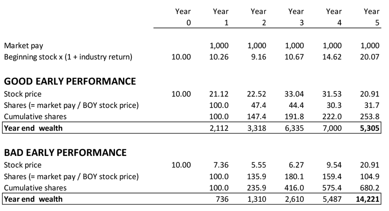
“Year end wealth” shows the calculation of cumulative “mark to market” pay at the end of each year. Cumulative mark to market pay is the value of cumulative pay based on the stock price at the end of the year. Our Bad Early Performance CEO gets five year cumulative mark to market pay of $14,221. This is 2.7x more than the $5,305 that our Good Early Performance CEO gets for the same cumulative performance. Let’s now compare the relative pay and relative performance for our two CEOs. Relative pay is mark to market pay divided by cumulative market pay, $5,000. Our Bad Early Performance CEO has cumulative relative pay of 2.84 at the end of five years, while our Good Early Performance CEO has cumulative relative pay of 1.06. Relative performance is the ending shareholder wealth per share, $20.91, divided by shareholder wealth per share assuming industry average performance, $20.07, a ratio of 1.04. This shows that our Bad Early Performance CEO is paid far more than his relative performance warrants.
The conventional wisdom is that the percent of pay at risk is a good proxy for incentive strength. We can see in this example that both CEOs have 100% of their pay at risk but that the Bad Early Performance CEO receives a lot more money for the same performance. This suggests that percent of pay at risk is not a great measure of incentive strength. A better measure of incentive strength is the ratio of relative cumulative pay to relative cumulative performance. For Bad Early Performance, the ratio is 2.73 (= 2.84/1.04) at the end of five years, but it varied from 1.03 to 2.10 in the four years before that. For the Good Early Performance, the ratio is 1.02 (= 1.06/1.04) at the end of five years, but it varied from 0.67 to 1.03 in the four years before that.
Given that the sensitivity of relative pay to relative performance varies over time, we need a reasonable method to determine the average sensitivity over time. One useful way to do this is to calculate the regression trendline relating relative cumulative pay to relative cumulative performance for the five years. We get a more accurate measure of the relationship if we calculate the regression trendline using the logarithms of relative pay and relative performance. When we use logarithms, we’re assuming that the prediction errors are proportional to the relative performance ratio, not a constant ratio amount. Using logarithms, we find that the slope of the trendline is 0.61 for Good Early Performance and 2.18 for Bad Early Performance. This means that a 1% increase in relative performance increases relative pay by 0.6% for Good Early Performance, but by 2.2% for Bad Early Performance. This says that Bad Early Performance gives our CEO an incentive that is 3.6x greater than that he would have with Good Early Performance.
It’s important to recognize that our measure of incentive strength depends on our ability to calculate mark to market pay. If we limit ourselves to grant date pay, we see no difference between Good Early Perfomrance and Bad Early Performance. Both CEOs receive $1,000 of pay each year. Prior to 2023, investors in U.S. public companies had to estimate mark to market pay from the grant data reported in prior year proxies. This is an arduous task (I’ve done it!), so investors and their proxy advisors made no effort to calculate mark to market pay or to measure pay dimensions based on mark to market pay. In 2023, pursuant to regulations adopted in 2022 to implement a requirement, created by the Dodd- Frank Act of 2011, to disclose “Pay Versus Performance” including “Compensation Actually Paid”, companies were required to report mark to market pay for the prior three years. In 2024, a four year history was required, and, in 2025 and subsequent years, a five year history is required.
The newly required disclosure of “Compensation Actually Paid” leads to a simple and highly informative analysis that measures incentive strength, alignment and performance adjusted cost
The new “Pay Versus Performance” disclosures give us the ability to measure key pay dimensions for public companies. In this report, we limit our analysis to 1,097 companies with the same CEO for the past four years. We measure pay dimensions by calculating relative pay and relative TSR and then calculating the regression trendline relating the natural log of relative pay to the natural log of relative TSR. This regression gives us measures of four pay dimensions. The slope of the trendline gives us a measure of incentive strength, what we call “pay leverage”. Pay leverage tells us the percent change in relative pay associated with a one percent change in relative shareholder wealth. The correlation gives us a measure of pay alignment. The intercept gives a measure of performance adjusted cost, i.e., the pay premium at peer group average performance. The ratio of pay leverage to pay alignment (i.e., slope divided by correlation) gives us a measure of relative pay risk.
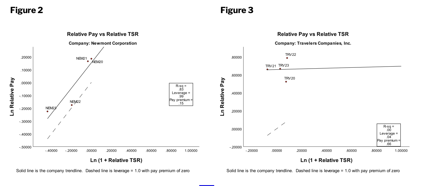
Let’s look at two examples. Figure 2 shows the trendline for the Newmont Corporation CEO Thomas Palmer while Figure 3 shows the trendline for Travelers CEO Alan Schnitzer. The peer group used to compute relative TSR for Newmont is a group of seven mining companies selected by Newmont.
The peer group used to compute relative TSR for Travelers is 13 insurance and related companies selected by Travelers. The solid line is the regression trendline. The dashed line is a line with a slope of 1.0 and an intercept of 0.0. It’s included in the graph to show how the subject company differs from a Perfect Correlation Pay Plan (discussed below) that makes relative pay equal to relative performance.
Relative pay is cumulative mark to market pay divided by cumulative market pay. Market pay is not reported in the new disclosures of “Pay Versus Performance”. We have to estimate market pay using industry trendlines relating the log of CEO pay to the log of company revenue. Since market pay is a present value number, we adjust it upward to reflect the expected difference between future value (i.e., mark to market pay) and present value. We also adjust Compensation Actually Paid to take out pay attributable to unvested grants made prior to the four year performance measurement period.
The measures we get from regressing log relative pay on log relative performance provide measures of a company’s success in achieving the three basic objectives of executive pay: providing strong incentives to increase shareholder value while retaining key talent and limiting shareholder cost. The slope of the trendline for Newmont CEO Tom Palmer is 0.99. This means that a 1% increase in relative shareholder wealth increases the CEO’s relative pay by almost 1%, 0.99%. This provides a strong incentive to increase shareholder value. By contrast, the slope of the trendline for Travelers CEO Alan Schnitzer is only 0.04. This means that a 1% increase in shareholder wealth increases the CEO’s relative pay by only 0.04%. This provides a very weak incentive to increase shareholder value.
The intercept of the trendline is the pay premium at peer group average performance. It provides a negative measure of retention risk and a positive measure of shareholder cost. The pay premium for Newmont is 0.15. It’s stated in natural logarithms. We can convert it to a percentage premium by taking the anti-log. The percentage premium is 16%
(= 100*(exp(0.15) – 1)). This says that Newmont pays 16% above average for average performance.
That limits retention risk because Newmont pays above average for average performance. It raises shareholder cost for the same reason. The pay premium shows that Newmont draws the balance between limiting retention risk and limiting shareholder cost slightly in favor of limiting retention risk. The natural log pay premium for Travelers is 0.66. The percentage pay premium is 93% (= 100*(exp(0.66)-1)). This pay premium shows that Travelers draws the balance between limiting retention risk and limiting shareholder cost very heavily in favor of limiting retention risk.
Calculating pay dimensions for 1,097 CEOs shows that many have pay problems: Weak incentives, high cost, low alignment or high risk
We have used the new disclosures to calculate pay dimensions for 1,097 U.S. public company CEOs. We limit the sample to companies with the same CEO for all four years.
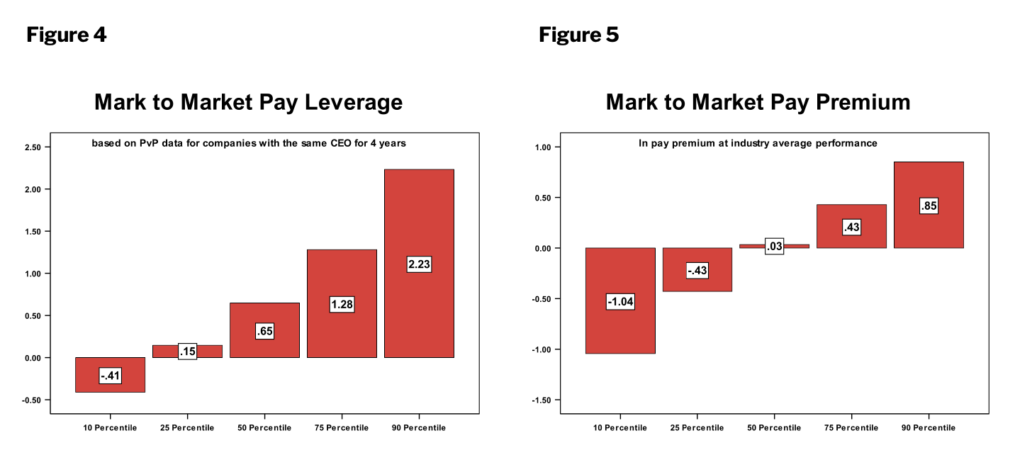
Figure 4 shows that the median CEO has pay leverage of 0.65. This means that a 1% increase in relative shareholder wealth increases relative pay by 0.65%. Below the median, pay leverage falls to 0.15 at the 25th percentile and to -0.40 at the 10th percentile. Only 15% of the companies below the median have pay leverage that is statistically significant at the conventional 5% level. Pay leverage above the median gets up to 2.23 at the 90th percentile and 55% of the companies above the median have pay leverage that is statistically significant. More companies should have statistically significant pay leverage next year when the PvP disclosure expands to five years.
The conventional wisdom says that percent of pay at risk is a good proxy for incentive strength, but our sample of 1,097 CEOs does not support the conventional wisdom. Four year average percent of pay in equity explains only 0.9% of the variation in pay leverage and four year average percent of pay at risk explains only 0.4% of the variation in pay leverage. In other words, both these percent at risk measures explain less than one percent of the variation in pay leverage. The data also shows companies don’t need high pay to support high pay leverage. The pay premium at industry average performance explains less than 1% of the variation in pay leverage and the difference between 75th percentile (1.28) and median pay leverage (0.65) is associated with a pay premium of only 3%.
Figure 5 shows percentiles for the pay premium at industry average performance. The values shown are in natural logarithms and can be converted to percentage pay premiums by taking the anti-log. The 90th percentile pay premium of 0.85 implies a percentage pay premium of +134% (since 100 * (exp(0.85) – 1) = 134%) and the 10th percentile pay premium of -1.04 implies a pay “premium” of -65% (since 100 * (exp(-1.04) – 1) = -65%). The conventional measure of compensation cost, i.e., four year average relative grant date pay, explains 48% of the variation in the mark to market pay premium at industry average performance for our sample of 1,097 companies.
The new disclosures provide compelling evidence that most companies don’t do a good job managing CEO pay
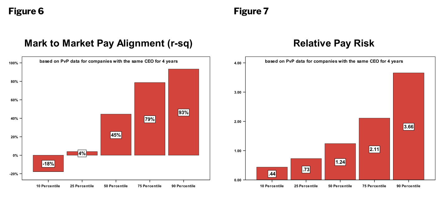
The bar charts help us think about a basic question: how many companies do a good job achieving the three basic objectives of executive pay? In other words, how many provide a strong incentive with a reasonable balance between retention risk and shareholder cost? Incentive strength, or pay leverage, is the product of pay alignment and relative pay risk. Since companies have different perspectives about appropriate risk levels, we’ll change our question to how many companies provide high alignment with a reasonable balance between retention risk and shareholder cost? We’ll define a good job of managing CEO pay as providing alignment (r-sq) of 50%+ with a pay premium at peer group average performance of +/-25% or less. Alignment (r-sq) of 50%+ means that relative performance explains at least half of the variation in relative pay. It’s disappointing to report that only 165 companies (15%) of the 1,097 companies in our sample do a good job of managing CEO pay. 303 companies have moderate shareholder cost, i.e., the pay premium at peer group average performance is 25% or less, and limited retention risk, i.e., the pay premium at peer group average performance is no lower than -25%, but 138 of these companies have low alignment (r-sq). This leaves us with only 165 (= 303 – 138) companies.
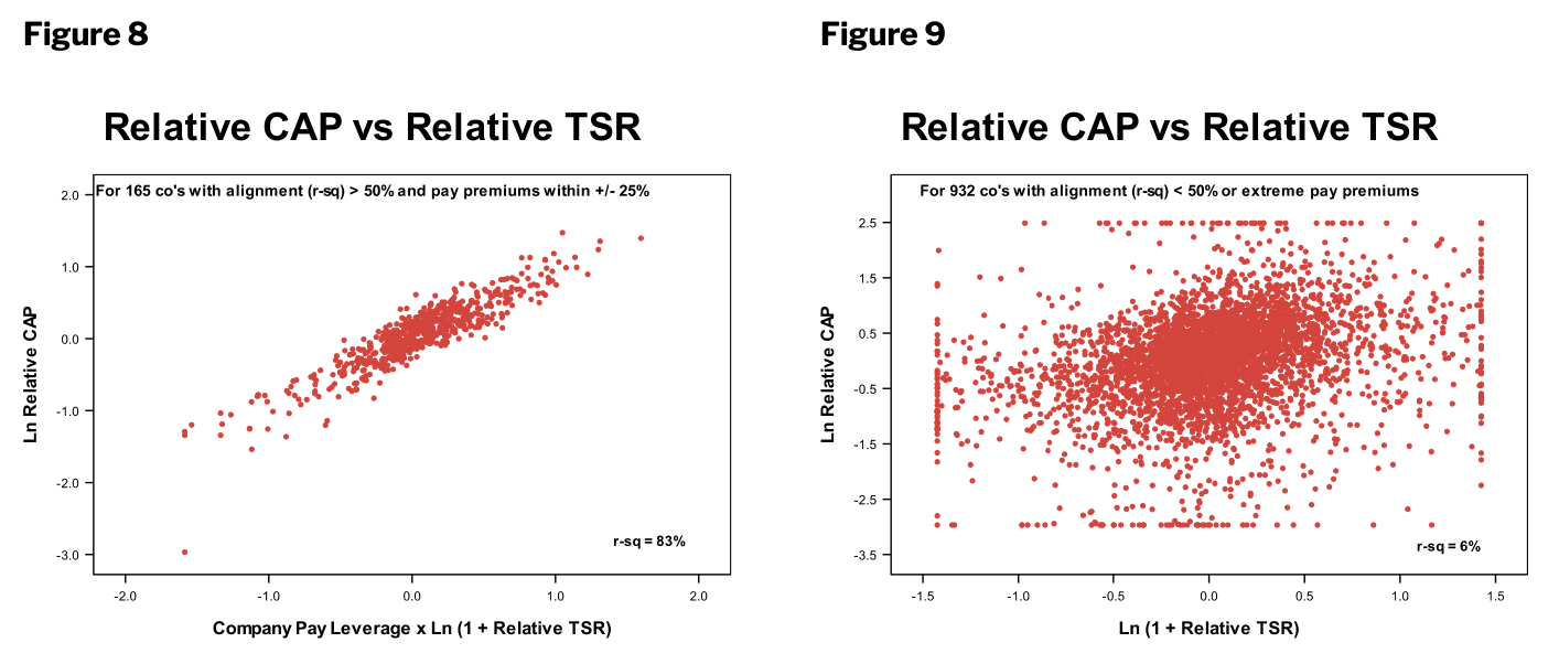
We get two quite striking pictures when we combine the good and the bad companies in separate scatterplots showing relative pay on the vertical axis against relative TSR on the horizontal axis. In the left panel, Figure 8, showing the good companies, we can see that relative TSR, adjusted for differences in individual company pay leverage, explains 83% of the variation in relative pay. This is what we would expect to see in a universe where pay for performance rules. But, unfortunately, this graph includes only 15% of our sample. In the right panel, Figure 9, with 85% of our sample, we can see that relative TSR explains only 6% of the variation in relative pay. We don’t show relative TSR adjusted for differences in individual company pay leverage in this graph because doing so reduces the variance explained.
These two graphs provide compelling evidence that most companies don’t do a good job of managing CEO pay. We only have this evidence because companies now report mark to market pay in the newly required Pay Versus Performance disclosure. This shows that the new disclosure requirement is very significant.
The evidence, in Figure 9, of poor pay plan design has had no impact on practice because proxy advisors and compensation consultants haven’t been aware of it. Proxy advisors and consultants have long been aware that relative grant date pay is poorly correlated with relative performance but they have dismissed the low correlation as irrelevant. Grant date pay is similar to target pay – because it doesn’t reflect post-grant changes in the value of equity compensation – and target pay should be, in the conventional wisdom, unrelated to past performance because it is meant to be sufficient to retain key talent regardless of past performance.
Why don’t companies do better? Poorly designed pay measures used by proxy advisor ISS are one reason
The basic concept of plotting relative pay against relative performance has been used by proxy advisors and consultants for many years but has never led to a pay leverage measure. The proxy advisor ISS has long compared CEO performance percentile with CEO pay percentile but it focuses on the difference between the two percentiles, calculated using three year average pay and performance measures. ISS doesn’t measure the sensitivity of pay percentile to performance percentile nor the correlation of the pay and performance percentiles. Moreover, by using percentiles instead of relative pay and relative TSR, ISS is telling companies that maintaining a consistent sensitivity of relative pay to relative performance is unimportant.
ISS uses three quantitative measures for “Pay-for- Performance” evaluation: “Relative Degree of Alignment” or “RDA”, “Multiple of Median” or “MOM”, and “Pay-TSR Alignment” or “PTA”. These measures are used to classify companies as having Low, Medium or High Concern. ISS conducts a qualitative review for companies with Medium and High Concern. The ISS approach to pay for performance evaluation encourages companies to adopt the key elements of the conventional wisdom. ISS’s quantitative measures encourage companies to target pay at the 50th percentile and its qualitative review encourages companies to increase their percent of pay at risk.
RDA is the difference between the CEO’s performance percentile and CEO’s pay percentile, measured using three year average pay and TSR. A difference of -50 triggers “Medium Concern” and a difference of -60 triggers “High Concern”. The large negative difference needed to trigger Medium Concern shows ISS’s support for competitive pay policy for poorly performing companies. ISS will not object if a company with 1st percentile performance pays at the 50th percentile.
Multiple of Median (MOM) is the ratio of the CEO’s pay to the median CEO pay of the company’s size adjusted industry peer group without any adjustment for the performance difference between the company and the peer group. If the Multiple of Median is more than 200% for S&P 500 companies, ISS triggers Medium Concern. If the Multiple of Median is more than 300%, ISS triggers High Concern. This measure shows ISS’s support for competitive pay policy for highly performing companies. Superior performance does not justify a pay premium greater than 100%.
A key consideration in the qualitative review is the “strength of performance-based compensation and rigor of performance goals.” The ISS review of Microsoft CEO pay in 2019 provides a good example of the ISS two step review process. Satya Nadella’s grant date pay of $39 million resulted in a 2.05 Multiple of Median which, in turn, triggered a qualitative review. ISS recommended a “no” vote for Say-on-Pay because Microsoft had increased Nadella’s salary from $1.5 million to $2.5 million (an increase representing less than 3% of Nadella’s total pay). ISS noted that “while some year-over-year base pay increases may be reasonable with the backdrop of strong long-term performance, any substantial increases should be strongly performance-based.” While ISS recommended a “no” vote, it failed to calculate the relative pay vs relative TSR trendline for Microsoft. That trendline, calculated using my estimates of mark to market pay based on Microsoft grant data, was ln relative pay = -0.42 + 1.75 x ln (1 + relative TSR) with an r-squared of 97%. The intercept shows that Microsoft CEO pay was 34% below average at industry average performance while providing high pay leverage (1.75) and very high pay alignment. The ISS “no” vote recommendation is extraordinary evidence that the ISS pay measures are poorly designed and cause it to miss the big picture shown by the relative pay vs relative performance regression trendline.

